Every visual designer must understand font psychology to communicate to their target reader effectively. Every font has its meaning and psychology behind it, so no wonder great copywriters and designers know how to use them properly.
You may have seen many fonts in Microsoft words, such as Calibri as a default font, and usually, your teacher tells you to use Times New Roman font instead of Comic Sans font, which has a larger size, despite its clarity.
Why are they so strict about such “trivial” issues? The psychology behind the font is the reason behind it all. Let’s dig it!
What is Font Psychology?

In graphic design, the designer must understand psychology, including font psychology, a psychological effect that happens when a human brain looks at a certain font’s shape.
Font’s shape becomes a pattern that is memorized by the human brain.
In every font’s shape, humans will always associate what they see often. The simpler term is “connect the dot.” The example of “connect the dot” is when you think about a goat, you will also think about their food (grass).
The font’s shape is usually different on many occasions. For instance, in a wedding invitation, the wedding organizer or the future bride/groom will use a font that is beautiful and not rigid. The purpose is to make a good impression on the future guest of the wedding party, of course.
The pattern will be remembered and will become a pillar of perception of human thought. Although, a different culture might trigger a different perception. Because of that, a good designer must adapt to that difference.
Every good designer can make a powerful impression or message by using the psychology behind fonts.
3 Type of Font Psychology
For your information, font psychology is divided into many types, but let’s break down this three for the basics.
1. Weight
Have you ever bold some font or highlighted your textbook because it is something important or a key point of some chapter? Well, it is part of the weight of the font.
There is a light, regular, bold, and black font with a different perspective when you look at them.
- Light: The font is usually thin; it gives a feminine, weak, and light.
- Regular: The font has a normal size, making it easier to read.
- Bold: You may meet the bolded font every day because you want to remember some key information, highlights some important facts, or when your boss tells you to bold the font even though you have no idea why it must be bolded. The bold font gives strength and a firm vibe. You always highlight a piece of key information because the key information equals strength.
- Black: There is a heavier font than the bold font called black font. The fonts trigger a quick emotional response. Because of that, black fonts are usually used in games and advertising.
2. Variety
Serif is divided into four types, and each of them has its uniqueness. For example, Sans Serif is solid.
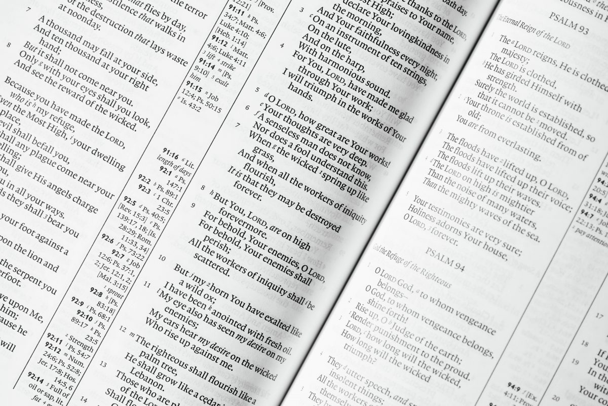
Serif: Elegant, formal, classic, exclusive, adult, and trustworthy
Sans Serif: Modern, brave, innovative, nonformal
Slab Serif: Contemporary, classy, and self-confidence
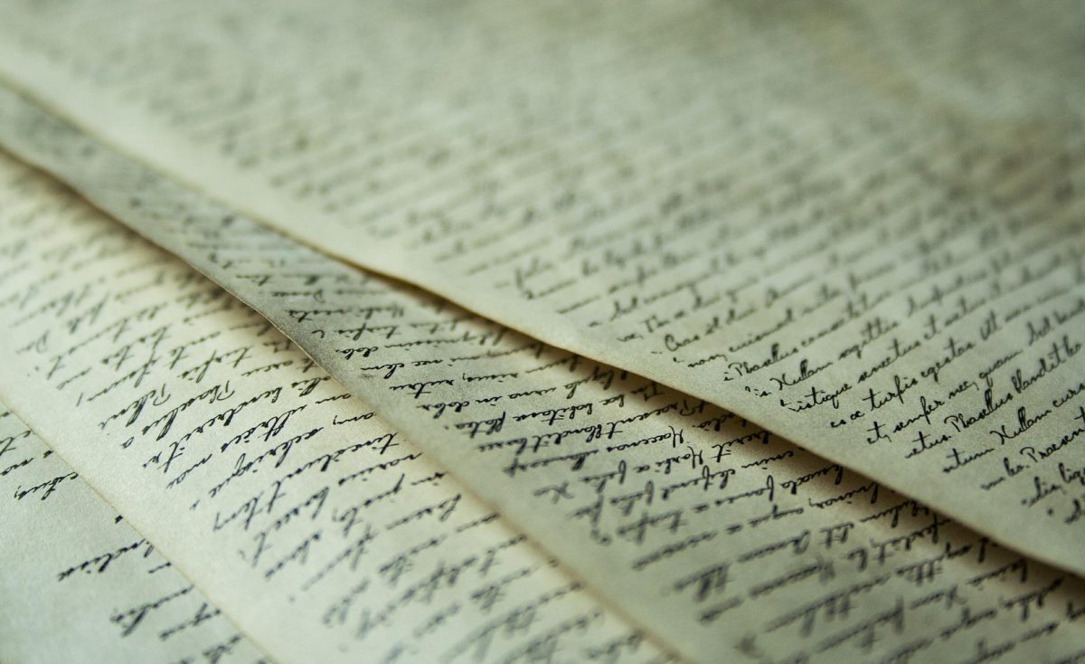
Script: Usually a cursive letter. It gives a relaxed vibe.
3. Slant
There are upright and italic fonts that represent something different:
Upright: Symbolizes calmness, stability, and durability
Italics: Gives a speedy, agile, and dynamic impression.
There are Many More Types, So, Don’t Ever Stop Learning

There are more than three types of font psychology such as tips, cases, and proportion. So, don’t feel full yet, and let’s learn much more!
3 Comments