When your design holds key information about your company or what it has to offer, it is important that your audience can understand what you are trying to convey. Mastering typography won’t just help you figure out how to get the point across to your audience but also how to display them in a way that can support your company’s branding.
The typographic scale is not something you should be skipping when learning about typography. This is especially true when you frequently have to make designs packed with a lot of information and text. This article will cover what it is and how it can help you create a good design for your audience. Interested? Let’s get right into it.
What Is It?
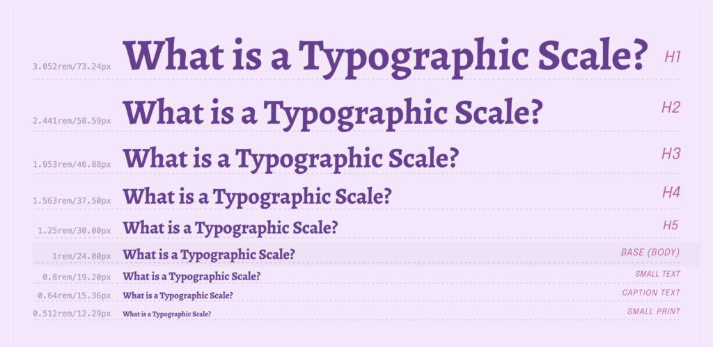
The typographic scale is a range or ordered set of character sizes that are defined with a ratio. Its purpose is to create consistency, harmony, and contrast in a typographic work. It serves as a guideline for picking the type of size variations in your design. Choosing one scale will keep your text consistent throughout your project.
Using a scale brings structure and order to a design. A scale starts off with a base size and then uses a set ratio to define the larger sizes. Its ratio can also be applied to a block of text’s line of height. The larger your text grows, the vertical spacing between the baselines will follow accordingly. This makes your text look neat and organized.
While it follows a certain mathematical formula, messy values are often skipped, and whole numbers are usually chosen in their place. Sometimes the numbers are simply rounded up instead. Even the classic typographic scale that has been used for over 400 years does not faithfully follow its formula to its last digits. There is a reason behind this.
The History Behind Type Scales
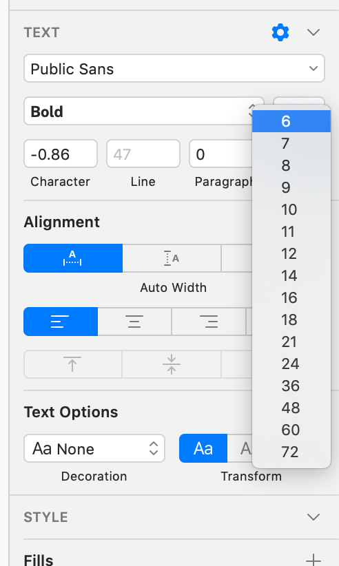
The first known scale, or the classic scale, consists of font sizes 6, 7, 8, 9, 10, 11, 12, 14, 16, 18, 21, 24, 36, 48, 60, 72, and so forth. Early typographers used these numbers to create visual harmony. However, the creation of this scale also relied on human intuition and thus contained mathematical errors.
When compared with a defined mathematical formula, deviations from the mathematical values can be seen in the numbers. For example, the scale does not include size 42 when it is perfectly in tune with the other font sizes. Size 11 also does not belong on the scale mathematically. There is also a rounding error in size 72 when it should have been 73 instead.
While the classic scale has its mathematical errors and was also based on human intuition, it proves that basing your text variations on a mathematical formula or a defined ratio can create visual harmony. The classic scale became the bedrock of modern typography and has been used for centuries to choose harmonious font sizes.
Commonly Used Scale Ratios
Most known common scale ratios are actually based on musical scales. Both types of scales can be used to create a certain flow, rhythm, and harmony in both visual and auditory media, respectively. It is believed that the same proportions that please the ears can work similarly to make things appeal to the eyes. This is why the ratios that can be found in music are used for type scale ratios.
The classic scale follows the ratio of the musical scale with a value of 2. As the first created scale became the basis for modern typography, people started experimenting with other known musical ratios and found out that they could work just as well. Musical scales being used as type scales thus became common in typographical works.
The famous golden ratio that often gets mentioned in anything visual can also be used in type scaling. Organic, natural, and visually appealing, the golden ratio is another popular choice commonly used in designs to achieve visual harmony. Its ratio value of 1.618 is often used for type scales alongside the commonly known musical ratios.
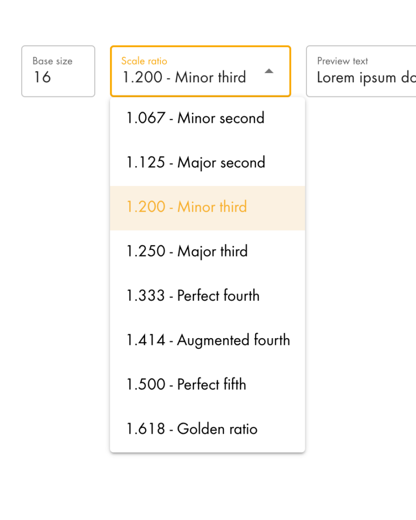
Below is a list of commonly known scale ratios:
- 1.200 — Minor Third
- 1.067 — Minor Second
- 1.125 — Major Second
- 1.200 — Minor Third
- 1.250 — Major Third
- 1.333 — Perfect Fourth
- 1.414 — Augmented Fourth
- 1.500 — Perfect Fifth
- 1.618 — The Golden Ratio
These ratios have been tried and tested over the years and are known to indeed create visually appealing and harmonious text size variations. The mathematical formulas behind them are why they work and create order in a design packed with text.
The Importance of Using a Typographic Scale
As mentioned earlier, using a scale helps you figure out the size variations of your text so that they look pleasing to the eyes of your audience. It can create a sense of balance and harmony in your design. It serves as a useful reference that can help you keep your text elements under control throughout your work.
The reason why the classic typographic scale was made in the first place was for practicality. Back when typesetting and printing technology had just been found, casting every font in every possible size wasn’t efficient. A set of standardized sizes was made to make size variety possible without making a huge amount of metal casts.
Using a mathematical ratio was thought to be the best way to define the scale of these sizes. Because of the mathematical formula behind it, the scale not only became useful for printing but also as a base or guide to make text size variations look visually appealing.
Using a Scale for Your Design
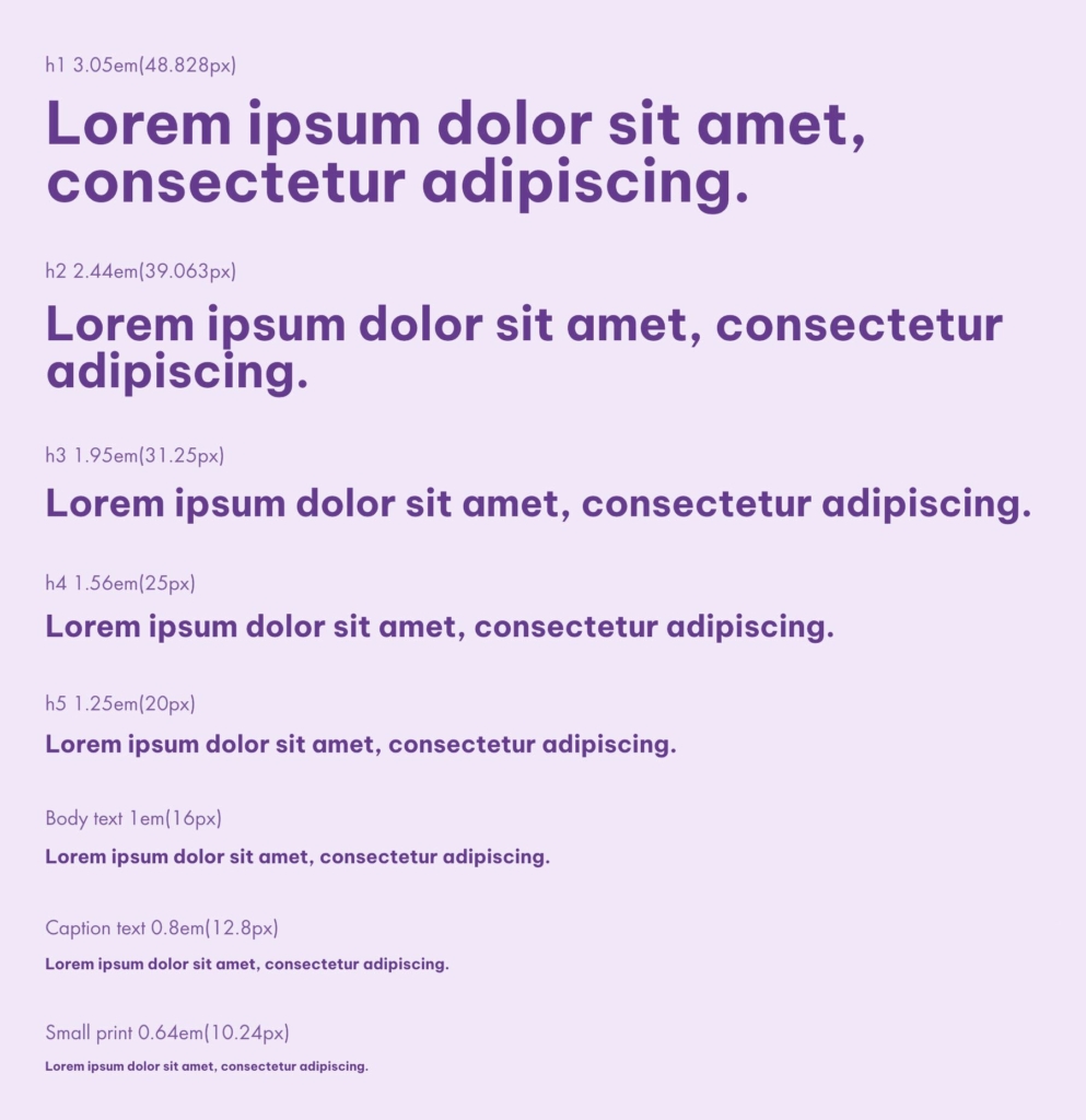
Now that you have understood how important type scales are, you might be interested in using one yourself. Here is how you make them work.
Start by settling on a base font and set your body text to a good size to make sure that your audience can easily read it. Use this as your base; from here, you can calculate your text size variations. Pick a ratio to use and input it into a type-scale calculator. Take note of the values as a reference; you are good to go.
If you are feeling creative and adventurous, you can create your own ratio and scale or tweak it with the calculated values. Known ratios and scales are in no way rules that are absolutely set in stone. They are merely guides that can help make your work easier when designing with a lot of text.
Making Your Own Scale
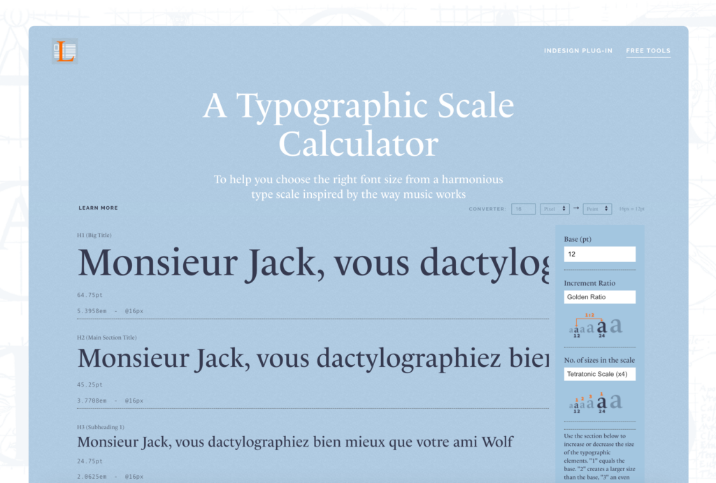
If you are thinking of making your own scale, you need to first understand how a typographic scale works. There are three defining properties in a scale, namely fundamental frequency (a), ratio (r), and steps (n).
The fundamental frequency is the base font size. For example, the fundamental frequency for printing typography would be 12 pt, and for web typography, it would be 1 em. The value depends on the font size of your body text.
The ratio is how much bigger the next font size variation will be. The famous and well-known musical ratio is r = 2. The classic scale uses this ratio. Changing the ratio changes the impact of your headings. According to your needs, a lower or a higher value of r might be more suitable for your design.
Steps or n is how many size variations you need. Changing the value of n changes the number of font sizes you will have in your palette. In general, it is best to have as few unused font sizes as possible.
The formula that is used with these three properties is ai = an x r^(i/n), with ai being the i-th size in the steps (n).
If you wish, you can manually calculate each font size using this formula and the three properties.
If you are still not sure how to calculate your font sizes, you can simply input the value of the three defining properties in a type-scale calculator. It will do the calculations for you and immediately provide you with the size variations you should be using based on your scale.
The numbers you get might be messy, and you can round them up if you wish. You are free to adjust them based on your design’s needs and your own intuition, just like how early typographers made the classic typographic scale. You can also just use the numbers from the calculator as is. Experiment with them as much as you want.
The point of using a scale is to give you a good starting point and lessen the amount of time you need to guess what sizes work together. Use the numbers from the calculator as a guide and adjust them accordingly when needed. Using this method will surely help you create a good design that is visually appealing for your audience.
An Afternote
A typographic scale is a useful tool that can be used as a guide to help you create visual harmony in a design packed with text. Using it in your design creates consistency, harmony, and contrast in your work. Experiment with the numbers from a scale, and you will surely be able to create a unique and visually appealing composition. Good luck!
